Amazing Google Web-Fonts!
Below is a list of some of my favourite Google Webfonts .They can be used across websites to display highlighed content and elegant design.
Abril Fatface
 Type Together
is currently my most favorite type foundry. They offer fresh and unique
designs of high quality and their fonts usually have a great language
support. Type Together were also one of the first type foundries which
supported the idea of webfont services.
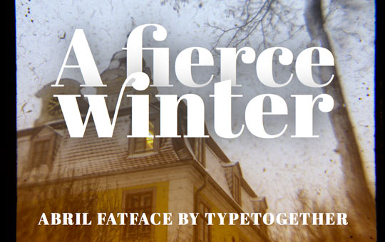
In the Google Webfonts Directory you can use their display font Abril Fatface. It is part of a bigger (commercial) type family system, with 18 Display and Text styles. The Fatface in particular is inspired by heavy titling fonts used in advertising posters in the 19th century Britain and France. The thin serifs and clean curves lend the typeface a refined touch and give any headline an elegant appearance. The character set that supports over 50 languages including those from Central and Northern Europe.
Live Demo | View at Google
Hammersmith One
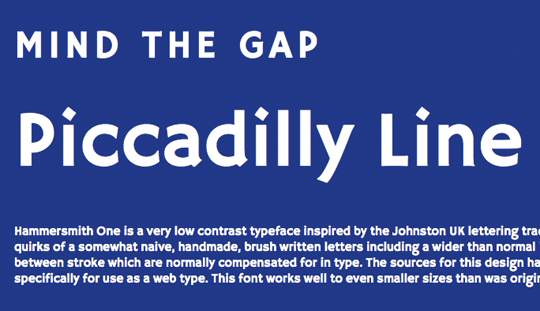
Hammersmith One by Nicole Fally is a very low contrast typeface inspired by the Johnston UK lettering tradition. Hammersmith One shows the quirks of a somewhat naive, handmade, brush written letters including a wider than normal “e” and “s” as well as dark joins between stroke which are normally compensated for in type. The sources for this design have been adapted not just for type but specifically for use as a web type. This font works well to even smaller sizes than was originally expected.
Live Demo | View at Google
Droid Sans, Droid Sans Mono & Droid Serif
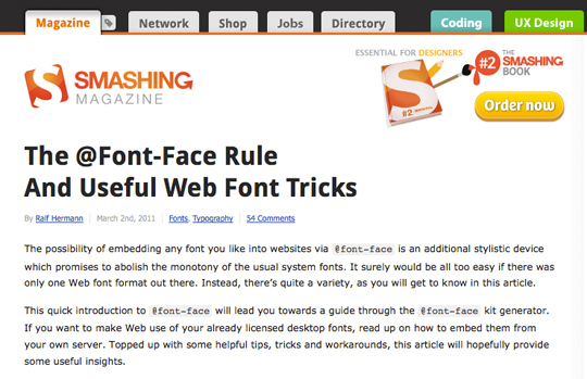 A lot of free fonts just come as single styles suitable for display
use, but if you are looking for a good replacement for over-used system
font families like Arial, Verdana and Georgia, the Droid fonts might be
perfect for you. This font family was originally created by Ascender
Corporation for use on the Android platform. As a live demo you can
check out Smashing Magazine
where Droid Sans regular and bold are used for headlines. The serif
comes in four styles and there is also a monospaced version available.
All of them can be used via Google Webfonts.
Live Demo | View sans View serif | View sans mono
Lato
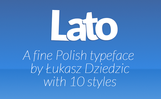
Polish type designer Łukasz Dziedzic has brought us great commercial typefaces such as FF Clan. The Lato family was originally conceived as a set of corporate fonts for a large client, but since this client later decided to go in different stylistic direction, this nice type family became Open Source. While the roman styles have a rather neutral appearance, the italics look great in larger sizes and with 10 styles (including hairline fonts) you have a great typographic variety when using this type family for websites.
Live Demo | View at Google
Vollkorn
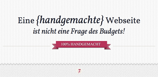 This font family by German type designer Friedrich Althausen
can be used as a quiet workhorse or as a catchy display typeface. While
the regular and italic styles are beautiful and elegant, the strong
serifs in the bold styles really draw attention to the text. The
webfonts of this family were manually hinted for best screen rendering,
even in small sizes.
Live Demo | View at Google
Ubuntu
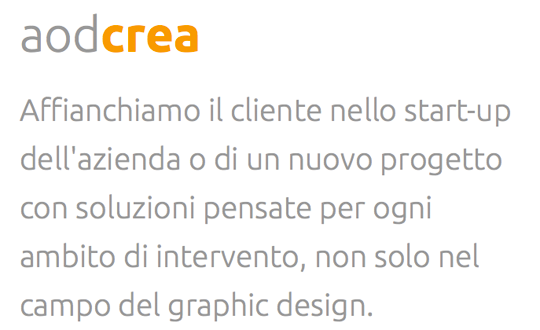
Even before its release this typeface has created some discussion because some designers found it too similar to the commercial typeface DTL Prokyon. As the name suggests, the font family is made for the Ubuntu operating system and over time should include all the languages used by the various Ubuntu users around the world. So the Ubuntu Font Family project will be extended to cover many more written languages. It comes in 8 styles and works great for headlines, but as this demo shows it can also be used for smaller text sizes.
Live Demo | View at Google
Playfair Display
 From the time of enlightenment in the late 18th century, the broad
nib quills were replaced by pointed steel pens. This influenced
typographical letterforms to become increasingly detached from the
written ones. Developments in printing technology, ink and paper making,
made it possible to print letterforms of high contrast and delicate
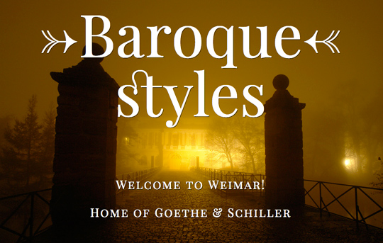
hairlines. Playfair Display by Claus Eggers Sørensen lends
itself to this period, and while it is not a revival of any particular
design, it takes influence from the designs of printer and typeface
designer John Baskerville, the punchcutter William Martin’s typeface for
the ‘Boydell Shakspeare’ (sic) edition, and from the ‘Scotch Roman’
designs that followed thereafter. As the name indicates, Playfair
Display is well suited for titling and headlines. Being a transitional
design, stylistically Playfair can accompany Georgia, where Georgia is
used for body text.
Live Demo | View at Google
UnifrakturMaguntia
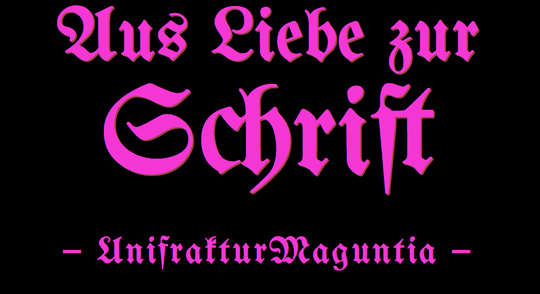 UnifrakturMaguntia is based on Berthold’s Mainzer Fraktur which
is in turn based on a 1901 typeface by Carl Albert Fahrenwaldt.
UnifrakturMaguntia uses smart font technologies for displaying the
font’s ligatures (OpenType, Apple Advanced Typography and SIL Graphite).
An experimental feature is the distinction of good blackletter
typography between required ligatures ‹ch, ck, ſt, tz› that must be kept
when letterspacing is increased, and regular ligatures (for instance,
‹fi, fl›) that are broken up when letterspacing is increased.
Live Demo | View at Google
I hope you enjoyed these fonts..Please remain subscribed for more web fun!
Aayush Agarwal owns a blog named Auxin Designs (http://auxindesigns.wordpress.com/), he has currently written about 80+ Creative Facebook Timeline Covers. Stay tuned for more of his posts! :)
Below is a list of some of my favourite Google Webfonts .They can be used across websites to display highlighed content and elegant design.
Abril Fatface
 Type Together
is currently my most favorite type foundry. They offer fresh and unique
designs of high quality and their fonts usually have a great language
support. Type Together were also one of the first type foundries which
supported the idea of webfont services.
 In the Google Webfonts Directory you can use their display font Abril Fatface. It is part of a bigger (commercial) type family system, with 18 Display and Text styles. The Fatface in particular is inspired by heavy titling fonts used in advertising posters in the 19th century Britain and France. The thin serifs and clean curves lend the typeface a refined touch and give any headline an elegant appearance. The character set that supports over 50 languages including those from Central and Northern Europe.
Live Demo | View at Google
Hammersmith One
Hammersmith One by Nicole Fally is a very low contrast typeface inspired by the Johnston UK lettering tradition. Hammersmith One shows the quirks of a somewhat naive, handmade, brush written letters including a wider than normal “e” and “s” as well as dark joins between stroke which are normally compensated for in type. The sources for this design have been adapted not just for type but specifically for use as a web type. This font works well to even smaller sizes than was originally expected.
Live Demo | View at Google
Droid Sans, Droid Sans Mono & Droid Serif
 A lot of free fonts just come as single styles suitable for display
use, but if you are looking for a good replacement for over-used system
font families like Arial, Verdana and Georgia, the Droid fonts might be
perfect for you. This font family was originally created by Ascender
Corporation for use on the Android platform. As a live demo you can
check out Smashing Magazine
where Droid Sans regular and bold are used for headlines. The serif
comes in four styles and there is also a monospaced version available.
All of them can be used via Google Webfonts.
A lot of free fonts just come as single styles suitable for display
use, but if you are looking for a good replacement for over-used system
font families like Arial, Verdana and Georgia, the Droid fonts might be
perfect for you. This font family was originally created by Ascender
Corporation for use on the Android platform. As a live demo you can
check out Smashing Magazine
where Droid Sans regular and bold are used for headlines. The serif
comes in four styles and there is also a monospaced version available.
All of them can be used via Google Webfonts.Live Demo | View sans View serif | View sans mono
Lato
Polish type designer Łukasz Dziedzic has brought us great commercial typefaces such as FF Clan. The Lato family was originally conceived as a set of corporate fonts for a large client, but since this client later decided to go in different stylistic direction, this nice type family became Open Source. While the roman styles have a rather neutral appearance, the italics look great in larger sizes and with 10 styles (including hairline fonts) you have a great typographic variety when using this type family for websites.
Live Demo | View at Google
Vollkorn
 This font family by German type designer Friedrich Althausen
can be used as a quiet workhorse or as a catchy display typeface. While
the regular and italic styles are beautiful and elegant, the strong
serifs in the bold styles really draw attention to the text. The
webfonts of this family were manually hinted for best screen rendering,
even in small sizes.
This font family by German type designer Friedrich Althausen
can be used as a quiet workhorse or as a catchy display typeface. While
the regular and italic styles are beautiful and elegant, the strong
serifs in the bold styles really draw attention to the text. The
webfonts of this family were manually hinted for best screen rendering,
even in small sizes.Live Demo | View at Google
Ubuntu
Even before its release this typeface has created some discussion because some designers found it too similar to the commercial typeface DTL Prokyon. As the name suggests, the font family is made for the Ubuntu operating system and over time should include all the languages used by the various Ubuntu users around the world. So the Ubuntu Font Family project will be extended to cover many more written languages. It comes in 8 styles and works great for headlines, but as this demo shows it can also be used for smaller text sizes.
Live Demo | View at Google
Playfair Display
 From the time of enlightenment in the late 18th century, the broad
nib quills were replaced by pointed steel pens. This influenced
typographical letterforms to become increasingly detached from the
written ones. Developments in printing technology, ink and paper making,
made it possible to print letterforms of high contrast and delicate
hairlines. Playfair Display by Claus Eggers Sørensen lends
itself to this period, and while it is not a revival of any particular
design, it takes influence from the designs of printer and typeface
designer John Baskerville, the punchcutter William Martin’s typeface for
the ‘Boydell Shakspeare’ (sic) edition, and from the ‘Scotch Roman’
designs that followed thereafter. As the name indicates, Playfair
Display is well suited for titling and headlines. Being a transitional
design, stylistically Playfair can accompany Georgia, where Georgia is
used for body text.
From the time of enlightenment in the late 18th century, the broad
nib quills were replaced by pointed steel pens. This influenced
typographical letterforms to become increasingly detached from the
written ones. Developments in printing technology, ink and paper making,
made it possible to print letterforms of high contrast and delicate
hairlines. Playfair Display by Claus Eggers Sørensen lends
itself to this period, and while it is not a revival of any particular
design, it takes influence from the designs of printer and typeface
designer John Baskerville, the punchcutter William Martin’s typeface for
the ‘Boydell Shakspeare’ (sic) edition, and from the ‘Scotch Roman’
designs that followed thereafter. As the name indicates, Playfair
Display is well suited for titling and headlines. Being a transitional
design, stylistically Playfair can accompany Georgia, where Georgia is
used for body text.Live Demo | View at Google
UnifrakturMaguntia
 UnifrakturMaguntia is based on Berthold’s Mainzer Fraktur which
is in turn based on a 1901 typeface by Carl Albert Fahrenwaldt.
UnifrakturMaguntia uses smart font technologies for displaying the
font’s ligatures (OpenType, Apple Advanced Typography and SIL Graphite).
An experimental feature is the distinction of good blackletter
typography between required ligatures ‹ch, ck, ſt, tz› that must be kept
when letterspacing is increased, and regular ligatures (for instance,
‹fi, fl›) that are broken up when letterspacing is increased.
UnifrakturMaguntia is based on Berthold’s Mainzer Fraktur which
is in turn based on a 1901 typeface by Carl Albert Fahrenwaldt.
UnifrakturMaguntia uses smart font technologies for displaying the
font’s ligatures (OpenType, Apple Advanced Typography and SIL Graphite).
An experimental feature is the distinction of good blackletter
typography between required ligatures ‹ch, ck, ſt, tz› that must be kept
when letterspacing is increased, and regular ligatures (for instance,
‹fi, fl›) that are broken up when letterspacing is increased.Live Demo | View at Google
I hope you enjoyed these fonts..Please remain subscribed for more web fun!
Aayush Agarwal owns a blog named Auxin Designs (http://auxindesigns.wordpress.com/), he has currently written about 80+ Creative Facebook Timeline Covers. Stay tuned for more of his posts! :)



0 comments:
Post a Comment